 |
| Glass Flowers by Colleen |
Wednesday, June 22, 2011
Cultivating Young Artists


Tuesday, May 24, 2011
Following the Sun
Spring has not really sprung here in Rhode Island, so traveled a little south to meet it en route. I went to Maryland for a long weekend where all the trees had leafed out, the azaleas were at peak and I didn't need to wear a jacket. A little plein air painting and visiting with my sister was a nice boost.
It has been pretty dreary since I got back, so I repainted those paintings - but not by choice!!! I carefully arranged my car for all my wet paintings (forgot the carrier), only to have my paint box slide over them when I accelerated. My landscapes had a bit of an abstract look, but they still had all the right color notes, I just needed to put them back in the right places. Here are two of my repair jobs.
Can't wait to get some local plein air paintings done. O.k. sun, I'm waiting.....
 |
| Bird Houses |
It has been pretty dreary since I got back, so I repainted those paintings - but not by choice!!! I carefully arranged my car for all my wet paintings (forgot the carrier), only to have my paint box slide over them when I accelerated. My landscapes had a bit of an abstract look, but they still had all the right color notes, I just needed to put them back in the right places. Here are two of my repair jobs.
 |
| The Old Man SOLD |
Friday, March 25, 2011
Painting with Ben and Sherwin
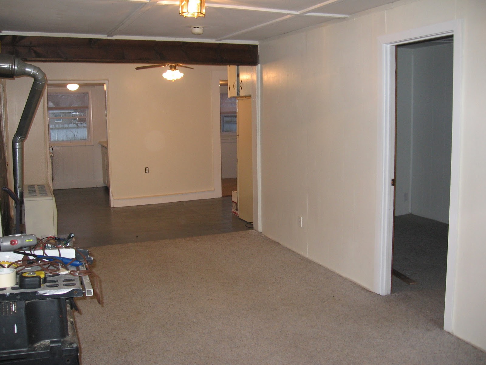 I've been painting every night this week with my buddies Benjamin Moore and Sherwin Williams. Nothing against their consistent quality, but I'd rather be spending time with my best bud, Winsor Newton. (Sounds like a sober George Thorogood song.) Actually, I really do enjoy painting rooms and trim, even if the final result can't be framed and sold. It can be exciting to transform the personality of a room or just refreshing years of wear and tear. I can't have too much fun with color as this is a rental. After 5 days of painting, I hope to find time to produce something "framable" for my big show at the RI Home Show.
Thursday, March 17, 2011
How to feel productive, without really trying?
Go find paintings you never finished!
About two years ago I started learning how to paint with oils. I used watercolors for many years and even then did not spend a lot of time painting. When I started with oils, I used the paint much like I did watercolor paint; very thin. I started painting some images from a whitewater rafting trip through the Grand Canyon, but put them aside. I'm glad I did. I've learned a lot in the last few years and I think these paintings are better than if I had finished them before. In a few years, I may look back at these paintings and say "I could do better." I finished these paintings, and two below, in record time. It helps if you have 75% of the painting completed.
NOTE: A year later (2/21/12), I looked at the two canyon paintings and thought about taking them out of the frame to make some improvements. This is a good thing! I've developed better painting skills over the past year.
 |
| Marble Canyon |
 |
| Nankoweap Canyon |
 |
| Blue Beached Boat SOLD |
 |
| Boogie Board |
NOTE: A year later (2/21/12), I looked at the two canyon paintings and thought about taking them out of the frame to make some improvements. This is a good thing! I've developed better painting skills over the past year.
Saturday, March 12, 2011
Learning To Paint Like The Masters - Part 5 (finished!)
 |
| SOLD |
The Lobster Pot is located in Provincetown, MA. It is a motif photographed and painted many times, but I don't mind being among the masses. This is such a lively painting with the vibrant reds against the glowing white building. One of my favorites!
Saturday, February 19, 2011
Surviving Winter
 |
| Early Morning Marsh SOLD |
 |
| Race Point Dune Path SOLD |
I suppose I could have painted snow scenes, because there was plenty to be found, but I like my little mental vacations.
Learning To Paint Like The Masters - Part 4
Well, I've started my glazing. This process requires a lot more patience than direct painting!

In the Lobster Pot painting the sky has about 4 layers. The first was yellow, then a Cerulean Blue (made it too green), then some Ultramarine Blue with white (made it too purple) then a very thin glaze of Veridian Green. Whew! The street started with a warm brown, then glazed over with Paynes Grey and white, and some small areas with Earth Green and white Most of the other parts have one or two layers with more to go. I'm not having much luck on the sunny side of the building. The top is too yellow and the bottom is too grey.
 The tea pot painting has only one layer of glazing. The drop cloth will next get a glaze of brown and the copper pot will get some red. Then I'll start on the cup and tea pot.

In the Lobster Pot painting the sky has about 4 layers. The first was yellow, then a Cerulean Blue (made it too green), then some Ultramarine Blue with white (made it too purple) then a very thin glaze of Veridian Green. Whew! The street started with a warm brown, then glazed over with Paynes Grey and white, and some small areas with Earth Green and white Most of the other parts have one or two layers with more to go. I'm not having much luck on the sunny side of the building. The top is too yellow and the bottom is too grey.

Friday, February 04, 2011
Learning To Paint Like The Masters - Part 3
Verdaccio is another Italian “old master” technique for underpainting. Here, I’ve used mixtures of Green Earth Hue (or Chromium Oxide green), Ivory black (a warm black) and Flake White. I thinned it down using Galkyd Lite but you can also use your “turps.” You want this layer to be thin, especially if you are going to glaze over this layer. Always remember “fat over lean” when applying paint. If you glaze with a thin layer over a thick layer of paint, the top layer may crack as the bottom layer dries.

Another version of this underpainting is the French grisaille technique which uses neutral or warm grey tones. Using what I learned in Color Theory class, verdaccio could be better for portraits as the green is a nice complement to the reds of skintones. Contemporary paintings are often stared with an underpainting using complementary colors.
Subscribe to:
Posts (Atom)